

We saw an opportunity for a real estate app with a sleek, modern UI tailored to first-time homebuyers. Our product, Perfect Properties, draws inspiration from Y2K fashion brands like Kith and Nike to resonate with our target audience.


Applications :
Involvment : Inital design, Wireframe, Prototypes

A Reality app
focused on helping first time homebuyers

About the Project
Over the course of a month, I was responsible for designing the UI for Perfect Properties. With research already completed, my main focus was crafting a sleek, user-friendly interface and building a prototype that could be easily shared with stakeholders and clients.
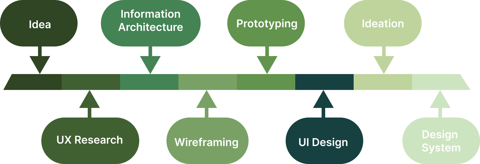
Information Gathering
Compotition


Before diving into my own design, I researched existing real estate apps to identify common UI elements and hierarchy patterns. This helped ensure a familiar and intuitive user experience and create my own flow map for the application.
Initial Design
Starting the Design Prossess
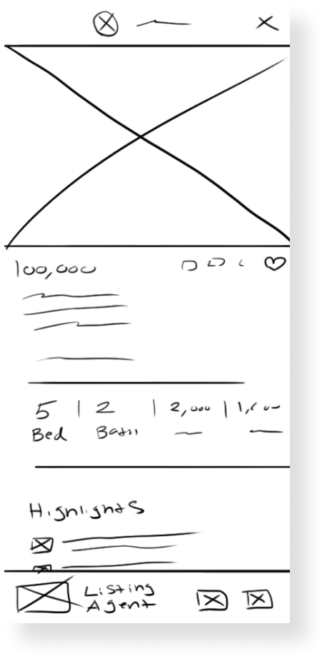
I sketched wireframes in Photoshop to map out each screen’s layout and get a clear sense of the app’s flow. This early planning helped me structure key features—like the map, agent directory, and filters—so everything felt seamless and intuitive before diving into the details.


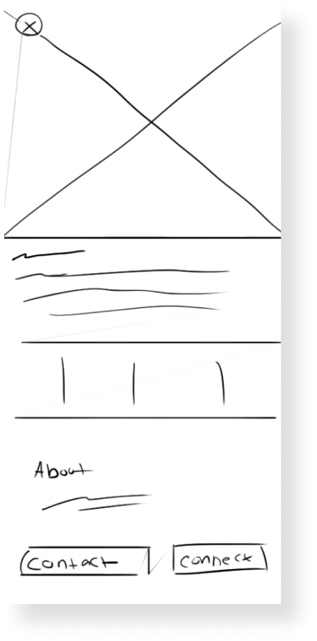

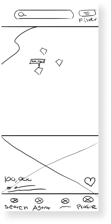

Low Fedility


After feedback from peers and clients, I refined the design by prioritizing primary actions. I gave buttons and input fields more space to stand out, drawing inspiration from fashion apps like Kith and Nike, which excel at guiding user focus.
Final Design

Style Guide
This style guide ensures design consistency by defining the app’s visual and functional standards. I chose green as the primary color to highlight natural home elements and create a calm, inviting experience that encourages user engagement.


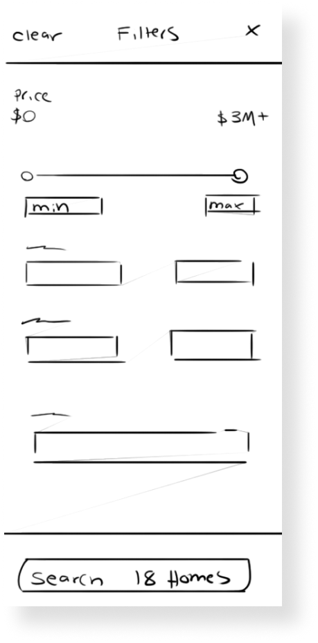
Sort & Filter
Designed "Sort" and "Filter" dropdowns to streamline content discovery, allowing users to quickly narrow results based on their preferences and enhancing overall navigation
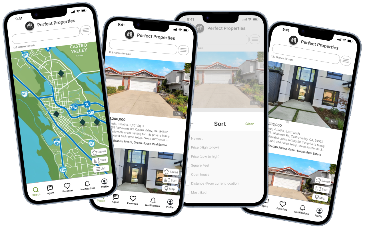
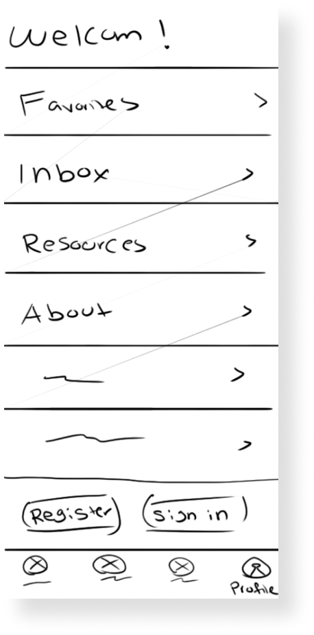
Home Page
I crafted the home screen to be bright and welcoming. It features a map and user-friendly icons that help users quickly navigate and conduct business within the app.
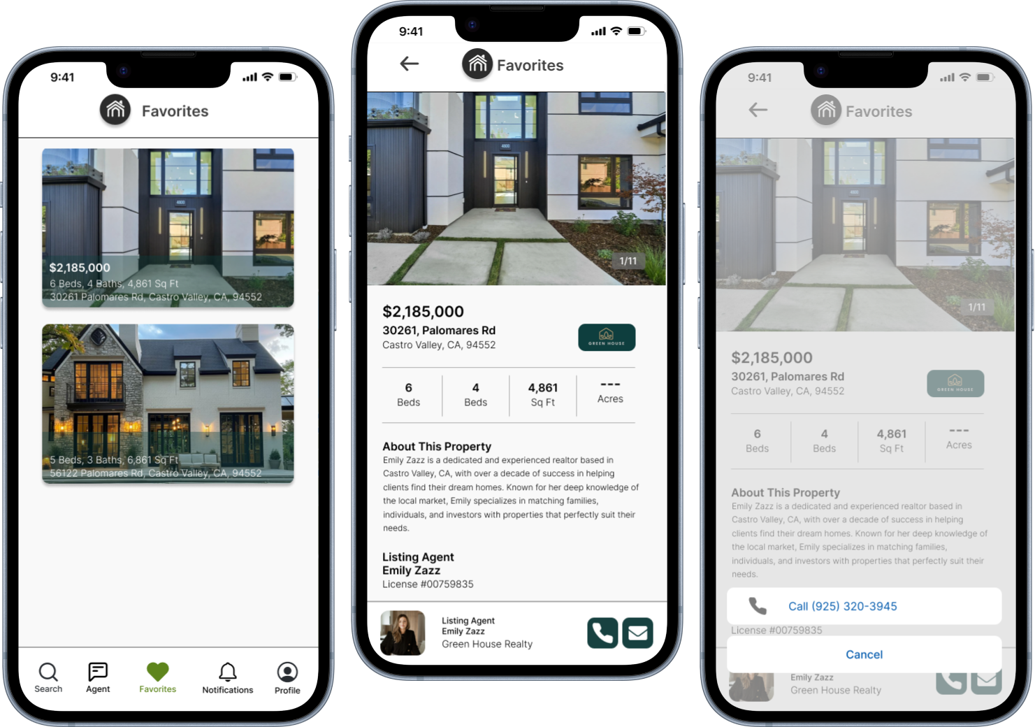
Favorites
The Favorites tab has a card-based layout that showcases images and essential details for quick, intuitive access to relevant information.
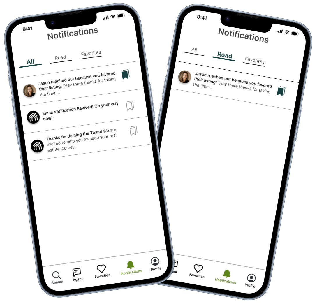
Notifications
I implemented a tabbed navigation system with clear labels like “Favorites” and “Read” to enhance usability, improve information hierarchy, and provide intuitive access to notifications.
Conclution
Next Steps
I learned a lot about the process during this project. I lost a lot of time and had to catch up; ultimately, I didn’t have much time to assemble everything. That being said, I am happy with the professionalism in the way I can present my process.
However, since this was primarily a visual project, it would have benefited greatly from a few unbiased eyes. I am pleased with my progress and the outcome, but if I were to continue with the project, I would conduct some user testing and then ideate the design from there.